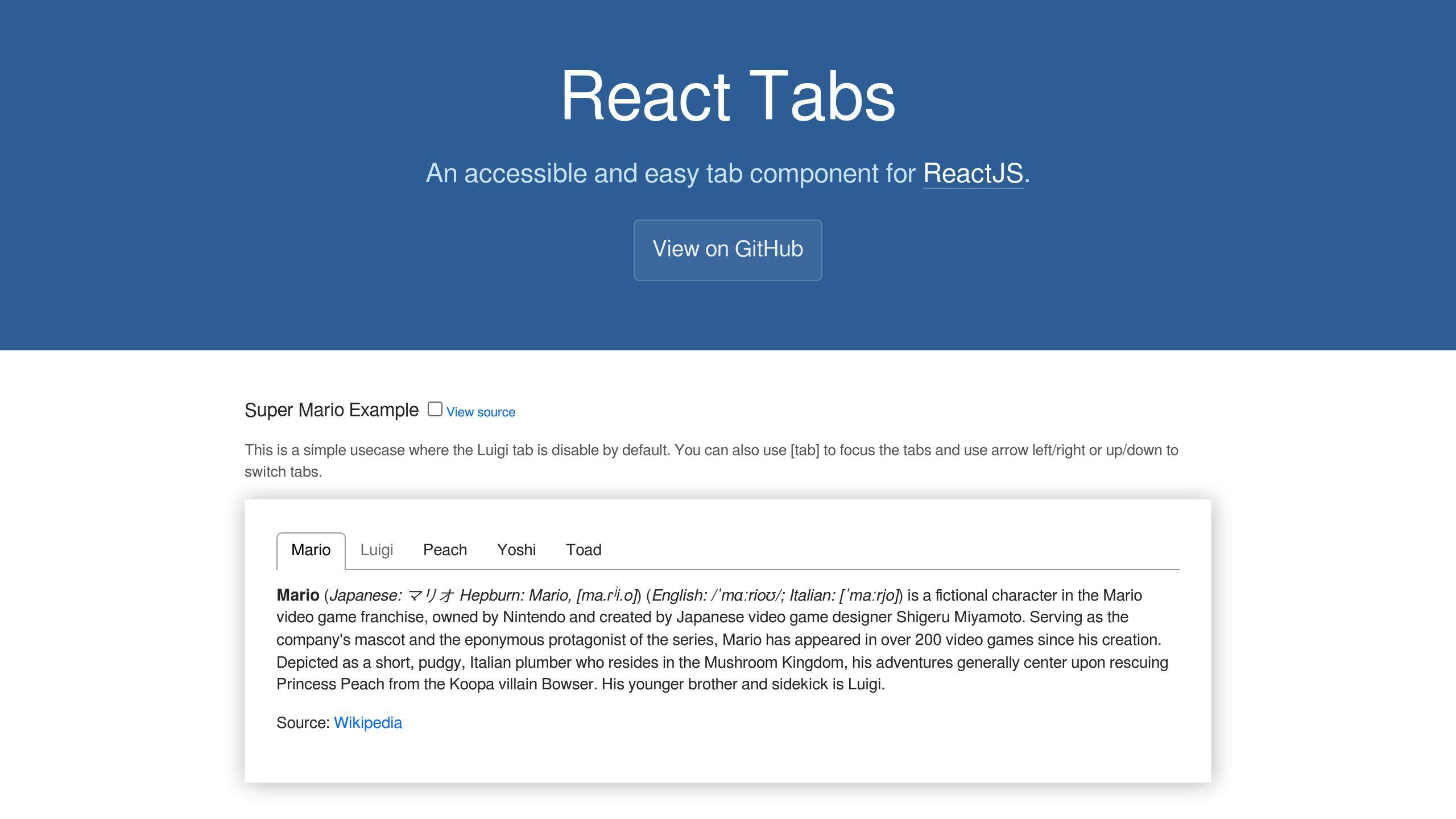
Tabs are a user interface component that organizes content into separate sections, allowing users to easily navigate and access related information. The react-tabs library provides a simple API for implementing tab functionality in React and Next.js applications.
Key Benefits of Using Tabs:
- Organize Content: Divide large amounts of information into smaller, manageable sections.
- Improve Navigation: Allow users to quickly switch between different views or sections.
- Enhance User Experience: Provide a clean and efficient way to access related content.
Getting Started with react-tabs in Next.js:
- Prerequisites: Have Node.js installed and familiarity with Next.js and React.
- Install react-tabs: Use npm or yarn to install the react-tabs library.
- Import Components: Import necessary components from react-tabs.
- Define Tab Structure: Create a Tabs component with TabList and TabPanel components.
- Configure Tabs: Set up individual Tab components with labels and optional URLs.
- Handle Tab Clicks: Use the onClick prop to handle tab click events.
- Style Tabs: Customize tab appearance with custom CSS or the react-tabs API.
- Add Tabs to App: Render the Tabs component in your Next.js app.
- Provide Tab Content: Update TabPanel components to display desired content.
Key Features:
- Easy integration with Next.js
- Customizable styling
- Flexible content rendering
- Improved user experience
Resources:
| Resource | Description |
|---|---|
| react-tabs documentation | In-depth information on react-tabs |
| Next.js documentation | Learn more about Next.js and its features |
By following this guide, you can create user-friendly tabbed interfaces in your Next.js applications using the react-tabs library, enhancing content organization and navigation for your users.
Getting started
To create tabs in Next.js using the react-tabs library, you'll need to have a few basic tools and knowledge in place.
Prerequisites
First, ensure you have Node.js installed on your machine, as it's required for creating and running Next.js applications.
You should also be familiar with Next.js and React, as we'll be building upon these technologies to implement tab functionality. If you're new to Next.js or React, consider exploring their official documentation and tutorials to get started.
Create a new Next.js project
Create a new Next.js project using create-next-app or use an existing one as a starting point. For demonstration purposes, we'll create a new project using create-next-app.
With these basics in place, you're ready to move forward and install the react-tabs library, which we'll cover in the next section.
Install react-tabs
To use the react-tabs library in your Next.js project, you need to install it. You can do this using either npm or yarn.
Installation options:
| Package Manager | Command |
|---|---|
| npm | npm install --save react-tabs |
| yarn | yarn add react-tabs |
Check React version
Before installing react-tabs, make sure you're using a compatible version of React. The react-tabs library supports React 16.3.0 or newer.
React version requirements:
| React Version | Required react-tabs Version |
|---|---|
| 18 or newer | 5 or newer |
| 16.8 or newer | 4 |
Verify your React version to ensure a smooth installation and integration of react-tabs in your Next.js project.
Set up tabs
To create tabs in your Next.js application using the react-tabs library, follow these steps:
Import necessary components
First, import the required components from the react-tabs library:
import { Tabs, TabList, Tab, TabPanel } from 'react-tabs';
Define tab structure
Next, define the structure of your tabs within a Next.js component. Create a Tabs component that contains a TabList and one or more TabPanel components.
Here's an example:
<Tabs>
  <TabList>
    <Tab>Tab 1</Tab>
    <Tab>Tab 2</Tab>
    <Tab>Tab 3</Tab>
  </TabList>
  <TabPanel>Content for Tab 1</TabPanel>
  <TabPanel>Content for Tab 2</TabPanel>
  <TabPanel>Content for Tab 3</TabPanel>
</Tabs>
In this example, we've defined a Tabs component with a TabList containing three tabs, and three TabPanel components that will display the content for each tab.
By importing the necessary components and defining your tab structure, you've set up the foundation for creating tabs in your Next.js application using the react-tabs library.
Create tabs
Configure tabs
To create individual tabs, you need to configure the Tab components within the TabList. Each Tab component should have a unique label and an optional href prop if you want to link to a specific URL.
Here's an example:
<TabList>
  <Tab href="/tab1">Tab 1</Tab>
  <Tab href="/tab2">Tab 2</Tab>
  <Tab href="/tab3">Tab 3</Tab>
</TabList>
In this example, we've defined three Tab components with unique labels and href props.
Handle tab clicks
To handle tab clicks, you need to set up event handlers for the Tab components. You can use the onClick prop to attach a function that will be called when a tab is clicked.
Here's an example:
<TabList>
  <Tab href="/tab1" onClick={() => console.log("Tab 1 clicked!")}>
    Tab 1
  </Tab>
  <Tab href="/tab2" onClick={() => console.log("Tab 2 clicked!")}>
    Tab 2
  </Tab>
  <Tab href="/tab3" onClick={() => console.log("Tab 3 clicked!")}>
    Tab 3
  </Tab>
</TabList>
In this example, we've added an onClick prop to each Tab component, which will log a message to the console when the tab is clicked.
By configuring tabs and handling tab clicks, you can create a functional tab component that allows users to switch between different content sections.
sbb-itb-5683811
Style tabs
When it comes to styling tabs, you have two primary options: using custom CSS or leveraging the react-tabs API. Both approaches allow you to tailor the appearance of your tabs to fit your application's unique needs.
Custom CSS
You can apply custom styles to your tabs using CSS. For example, you can use the following CSS to distinguish active tabs:
.Tab {
  background-color: #f0f0f0;
  border-bottom: 2px solid #ccc;
  padding: 10px;
}

.Tab.active {
  background-color: #fff;
  border-bottom: 2px solid #337ab7;
  padding: 10px;
}
In this example, we've defined a basic style for the .Tab component and an active state style for the .Tab.active class. You can customize these styles to fit your application's design.
Use react-tabs API
React-tabs provides a built-in API for customizing the appearance of your tabs. You can use the theme prop to pass a custom theme object to the Tabs component. For example:
import { Tabs, TabList, Tab } from 'react-tabs';

const customTheme = {
  Tab: {
    backgroundColor: '#f0f0f0',
    borderBottom: '2px solid #ccc',
    padding: '10px',
  },
  TabActive: {
    backgroundColor: '#fff',
    borderBottom: '2px solid #337ab7',
    padding: '10px',
  },
};

<Tabs theme={customTheme}>
  <TabList>
    <Tab>Tab 1</Tab>
    <Tab>Tab 2</Tab>
    <Tab>Tab 3</Tab>
  </TabList>
</Tabs>
In this example, we've defined a custom theme object with styles for the Tab and TabActive components. We then pass this theme object to the Tabs component using the theme prop.
By using custom CSS or the react-tabs API, you can create visually appealing tabs that fit your application's design and enhance the user experience.
Add tabs to Next.js app
Now that we have our Tabs component set up, let's incorporate it into our main Next.js application file.
Update app component
To add the Tabs component to our Next.js app, we'll update the pages/_app.js file. This file serves as the entry point for our application, and we'll use it to render our Tabs component.
Here's an example of what the updated pages/_app.js file might look like:
import Tabs from '../components/Tabs';

function App({ Component, pageProps }) {
  return (
    <div>
      <Tabs>
        <TabList>
          <Tab>Tab 1</Tab>
          <Tab>Tab 2</Tab>
          <Tab>Tab 3</Tab>
        </TabList>
        <TabPanel>Content for Tab 1</TabPanel>
        <TabPanel>Content for Tab 2</TabPanel>
        <TabPanel>Content for Tab 3</TabPanel>
      </Tabs>
      <Component {...pageProps} />
    </div>
  );
}

export default App;
In this example, we've imported our Tabs component and rendered it within the App component. We've also added a TabList with three tabs and corresponding TabPanel components to display content for each tab.
Provide tab content
To provide content for each tab, we'll update the TabPanel components to render the desired content. For example:
<TabPanel>
  <h2>Tab 1 Content</h2>
  <p>This is the content for Tab 1.</p>
</TabPanel>
<TabPanel>
  <h2>Tab 2 Content</h2>
  <p>This is the content for Tab 2.</p>
</TabPanel>
<TabPanel>
  <h2>Tab 3 Content</h2>
  <p>This is the content for Tab 3.</p>
</TabPanel>
By updating the TabPanel components, we can provide unique content for each tab, enhancing the user experience and making it easier to navigate our application.
Remember to customize the content and styling of your tabs to fit your application's specific needs.
Summary
Creating tabs in Next.js applications using the react-tabs library is a simple process. By following the steps outlined in this guide, you can easily add tabbed interfaces to your Next.js projects, making it easier for users to navigate and access specific content.
Key Points
| Feature | Description |
|---|---|
| Easy Integration | The react-tabs library integrates seamlessly with Next.js, allowing you to quickly set up and configure tabs. |
| Customizable Styling | You can style your tabs to match your application's branding and design using custom CSS or the react-tabs API. |
| Flexible Content | Each tab panel can render dynamic content, enabling you to display different components or data based on the selected tab. |
| Improved User Experience | Tabs provide a clean and organized way to present information, making it easier for users to navigate and access specific content. |
By using Next.js and the react-tabs library, you can create user-friendly tabbed interfaces that enhance the user experience and streamline development.
Learn more
To further your understanding of creating tabs in Next.js with react-tabs, explore the following resources:
Resources
| Resource | Description |
|---|---|
| react-tabs documentation | In-depth information on react-tabs |
| Next.js documentation | Learn more about Next.js and its features |
These resources will provide you with a deeper understanding of creating tabs in Next.js with react-tabs and help you to improve your skills.

